Big Cartel for iOS
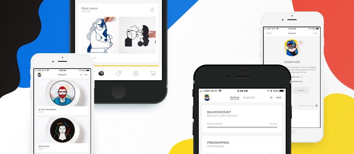
As part of the small-but-mighty team at Big Cartel, my work focused on the iOS ecosystem.

And here’s the megafeed of everything I’ve been doing.
As part of the small-but-mighty team at Big Cartel, my work focused on the iOS ecosystem.

Sad, excited, and terrified to say that after 3 years, I’m leaving Happy Cog. In 2015, I’ll be joining Big Cartel as an iOS developer!
I worked primarily as a front-end developer on this project, and was focused on building a flexible, modular system that could be implemented by the Papa John’s internal team to cover all of their needs across all of their markets. In addition, I spent a lot of time working directly with the team to improve their performance optimization workflow and increase the speed of experiences.
Today's Topic: Laundry. In Part 1 of a two-part episode, the hosts discuss when and how they perform this mundane activity and share where their clothes reside once clean.
The difference between knowledge and intelligence is an extremely important one. Knowledge is the collection of skills and information a person has acquired through experience. Intelligence is the ability to apply knowledge.
In client work, it’s our responsibility to ensure that our work lives beyond ourselves—our work’s future is the indicator of its success.
Some of the best and most useful things we build have humble beginnings. Small side projects start with a sapling of an idea—something that can be built in a weekend, but will make our work a little easier, our lives a little better.
We talk about gender and ethnic inequality in the workplace and society.
As an industry, we’re historically terrible at drawing lines between things, except when it comes to our roles. The old thinking of defined roles is certainly loosening up, but we still have a long way to go.
We talk about giving a shit about people through attention to details and wonder why it's such a tough sell.
Today's topic: Sandwiches. Anthony discusses mixing the meats. Aura and Patrick disapprove of the cutlet.
We talk about zero-sum mentality or the perceived lack of uniqueness that makes people hold off from sharing their thoughts and ideas with the world.
There are some simple JavaScript design patterns that developers of any level can start using to improve their code. These aren’t process-altering changes—just minor tweaks that make code more reusable, extensible, and understandable.
You can’t be at the top of your game while stressed and nervous about the emergency, so unless there’s an obvious, quick-to-deploy resolution, you need to give yourself some cover to work.
“Just” implies that all of the thinking behind a feature or system has been done. Even worse, it implies that all of the decisions that will have to be made in the course of development have already been discovered—and that’s never the case.
Today's Topic: Packing for Travel. The origin story of the podcast is revealed. The hosts also discuss various packing methods, emergency socks and underwear and how to deal with dirty laundry while traveling.
We talk about how it's okay to have no idea what you're doing and the important differences between raw knowledge and the ability to acquire it.
There’s a constant tension between that type of longform, art-directed content and content management systems. New tools like Craft’s Matrix field give developers the control they need to achieve such beautiful layouts.
We talk about unplugging, control, discipline, and fighting noise. Then we take a little detour through bad "science".
Craft’s Matrix is a game changer in the age-old battle between art-directed content and WYSIWYG editors. Matrix blocks, together with Twig’s template inheritance and multiple includes, provides us incredible power and flexibility within our templates.